Design opportunities
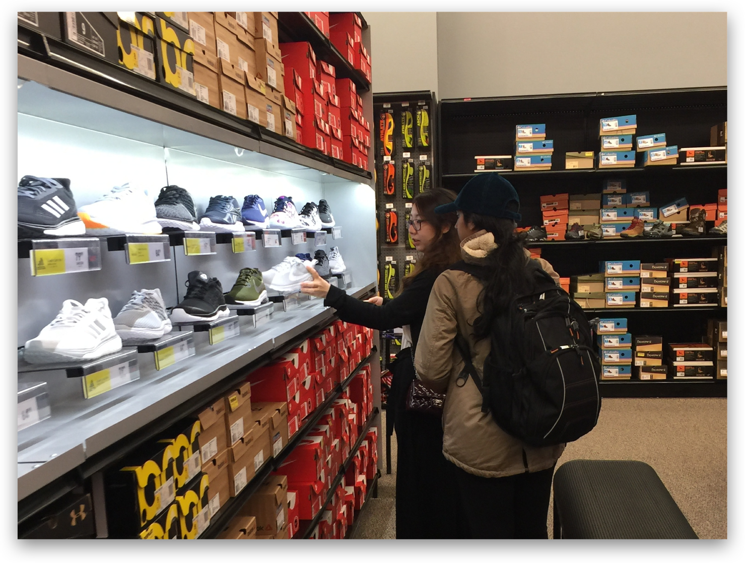
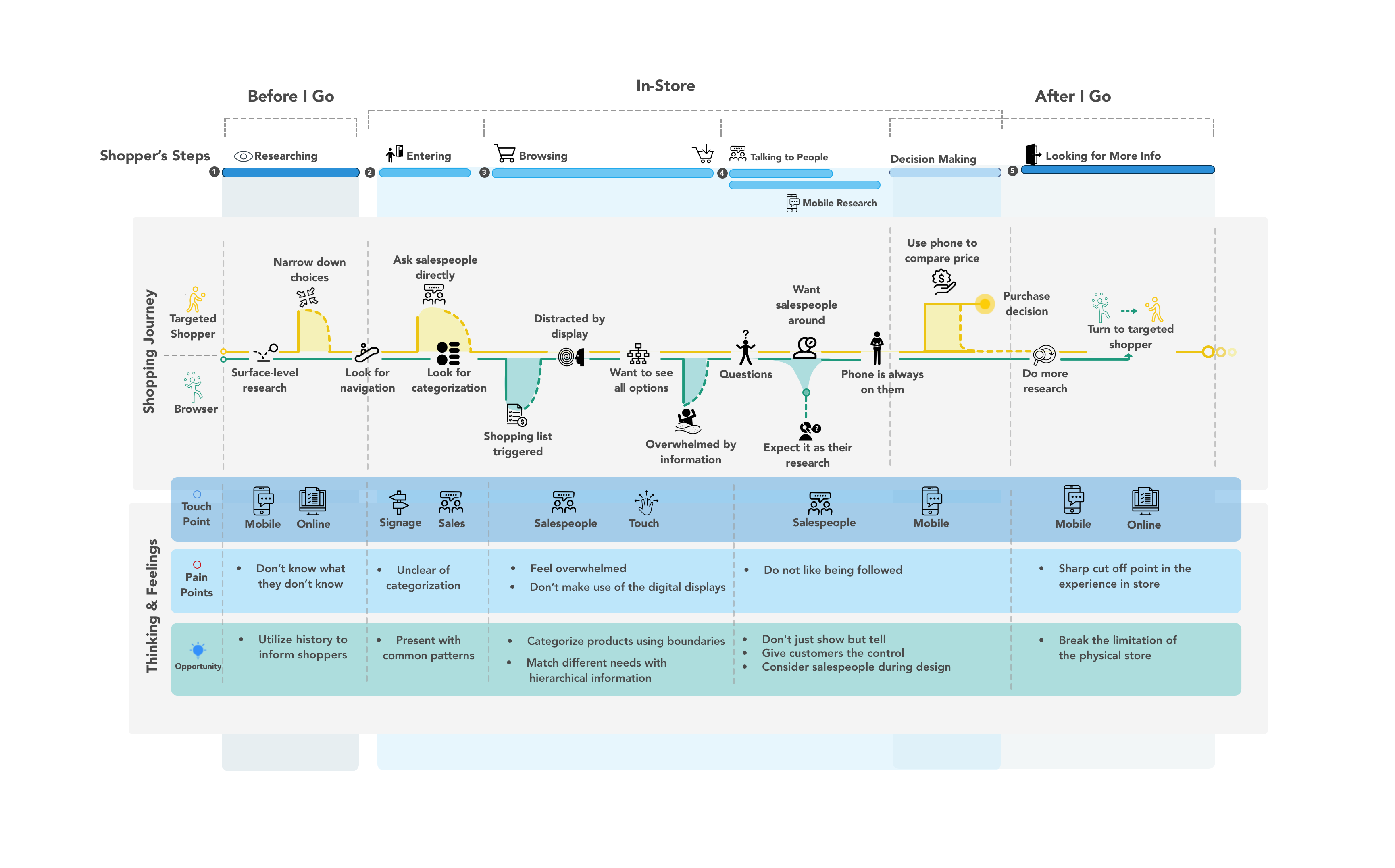
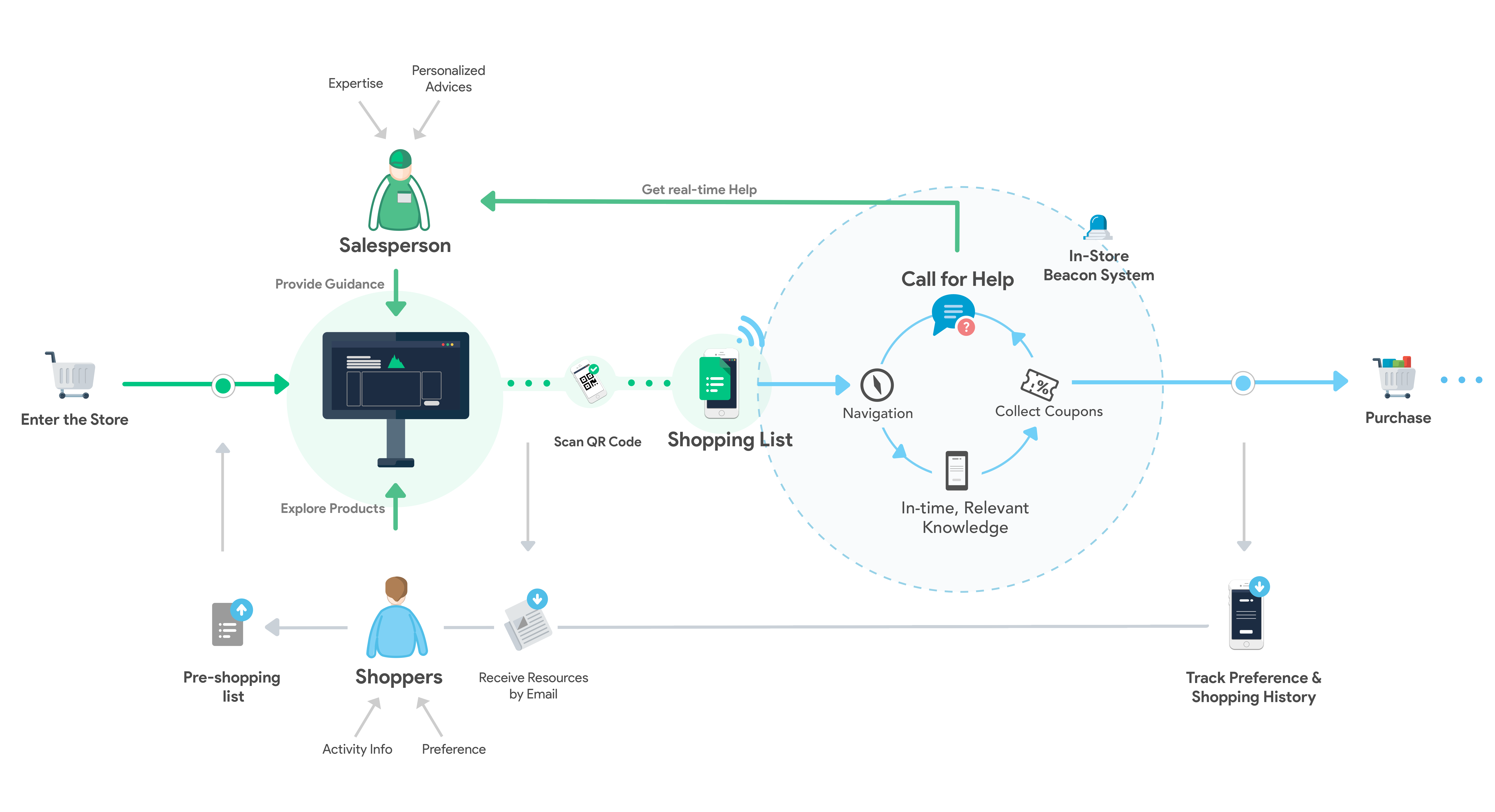
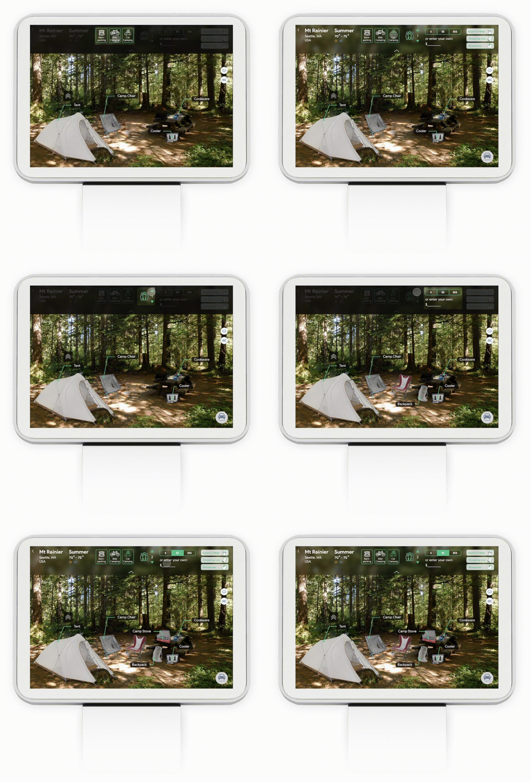
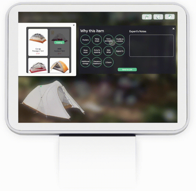
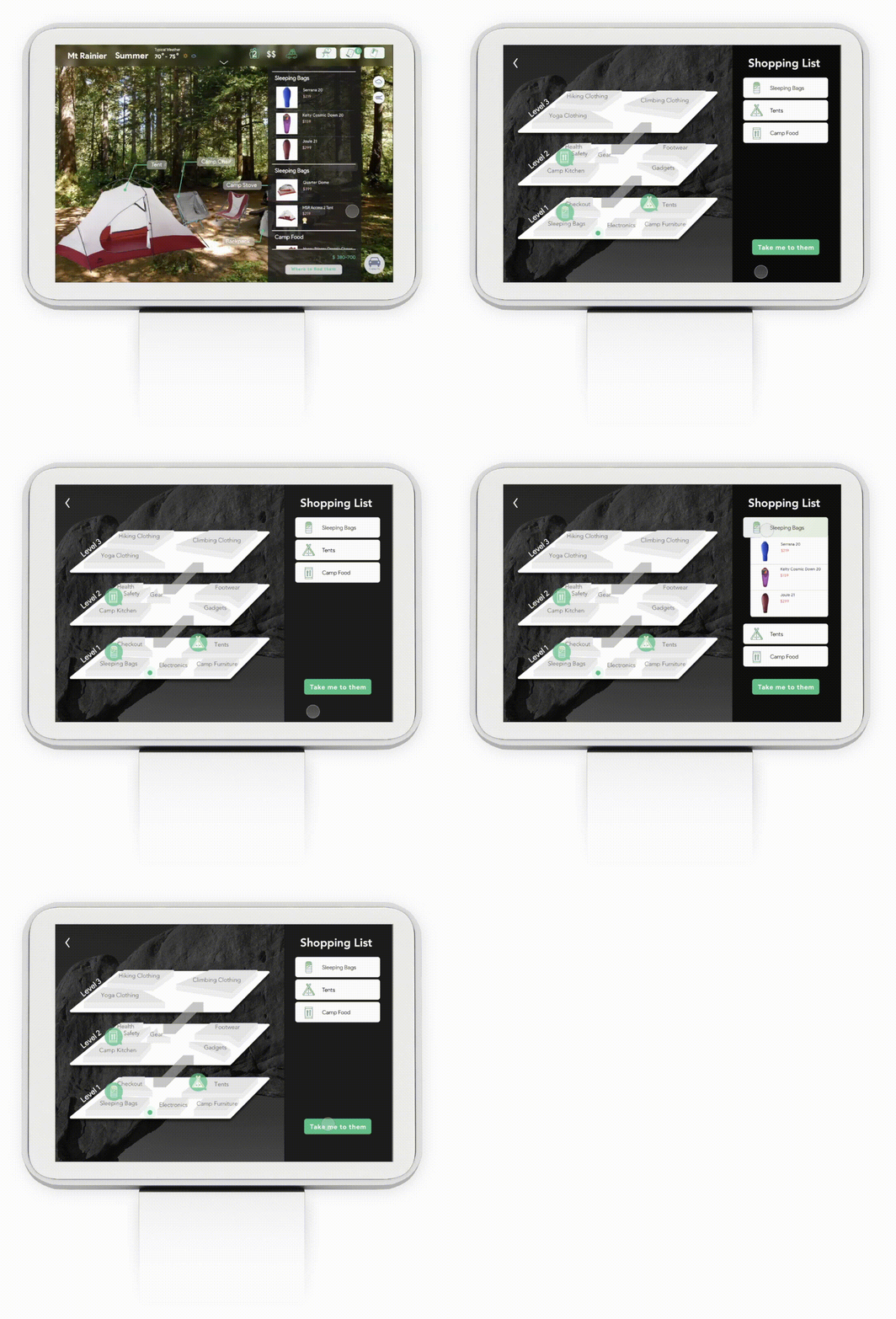
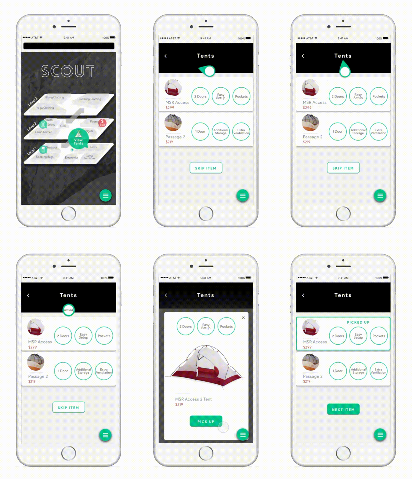
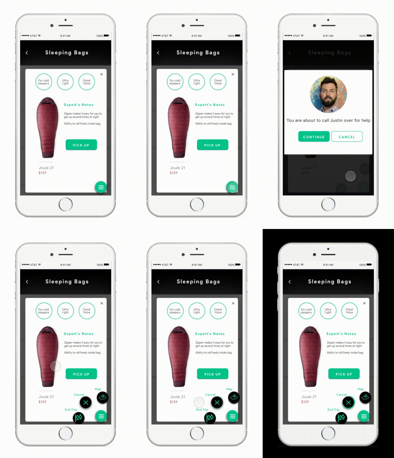
A difficult time for retail - The rapid growth of online shopping hits physical store hardly: 5300 stores were closed by mid-2017, which tripled last year's number. However, there is so much that the ecommerce cannot provide, such as the feeling of touch, the immersive experience of the shopping in-store, and the various services provided by salespeople. Our team is designing an omnichannel and fully engaged in-store shopping experience.
MHCI+D Capstone Project
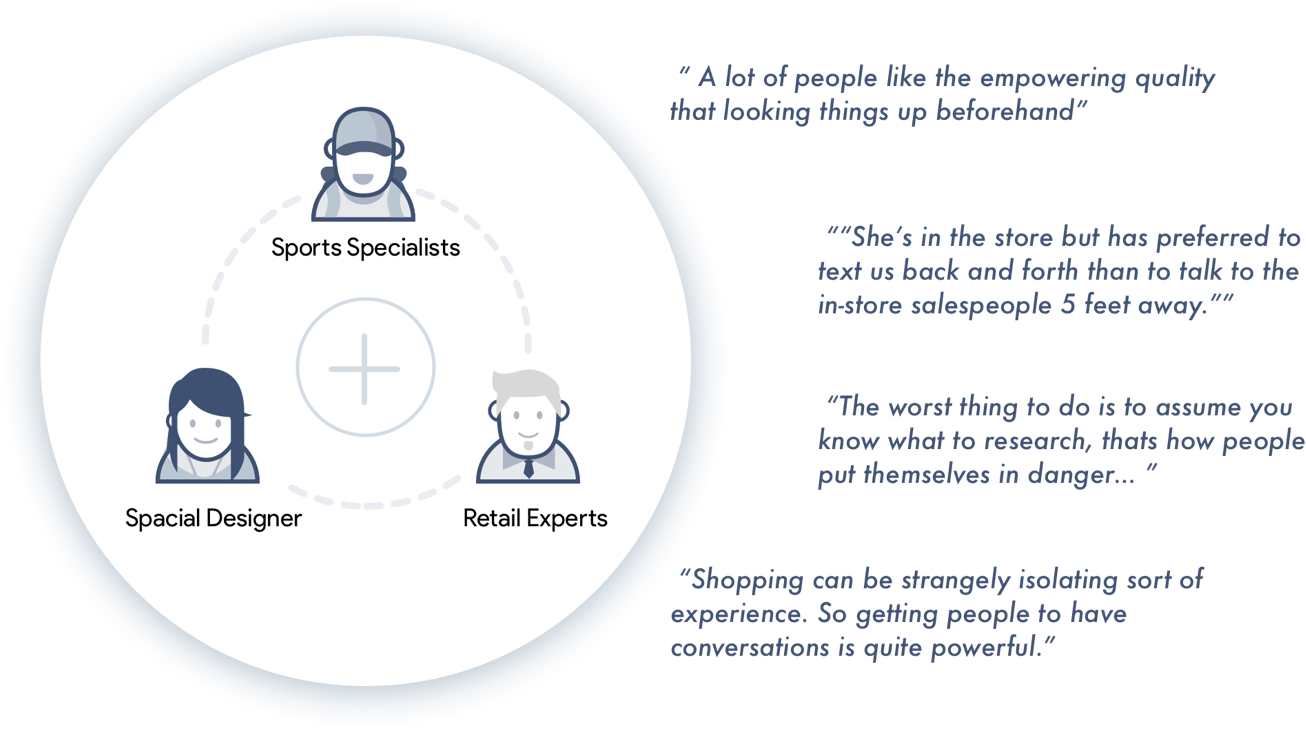
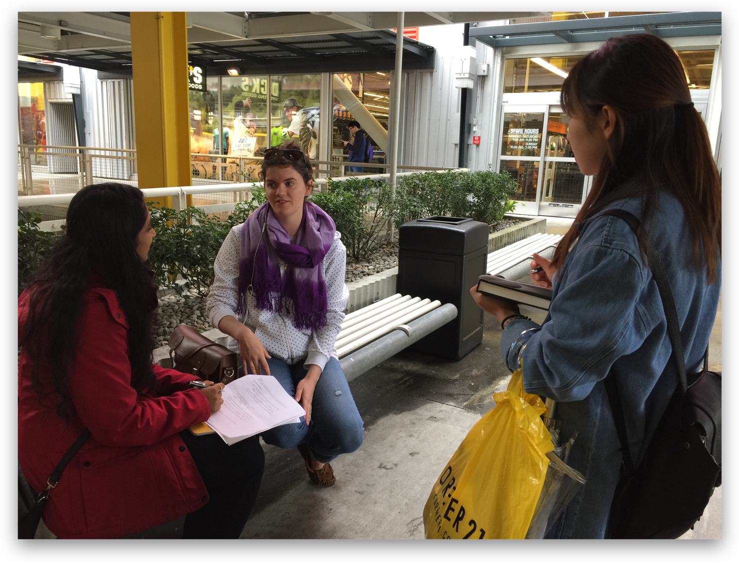
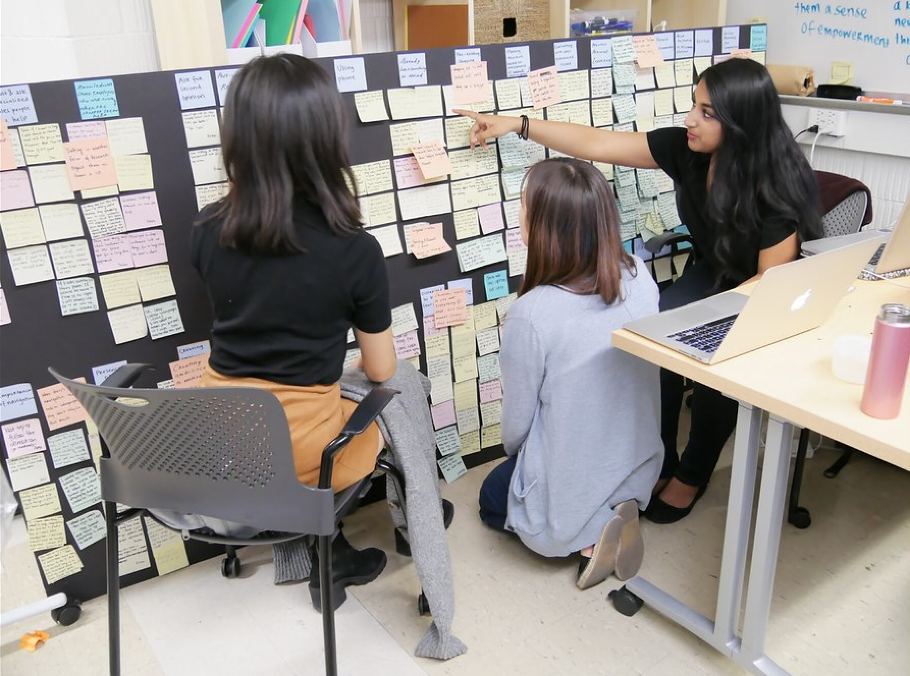
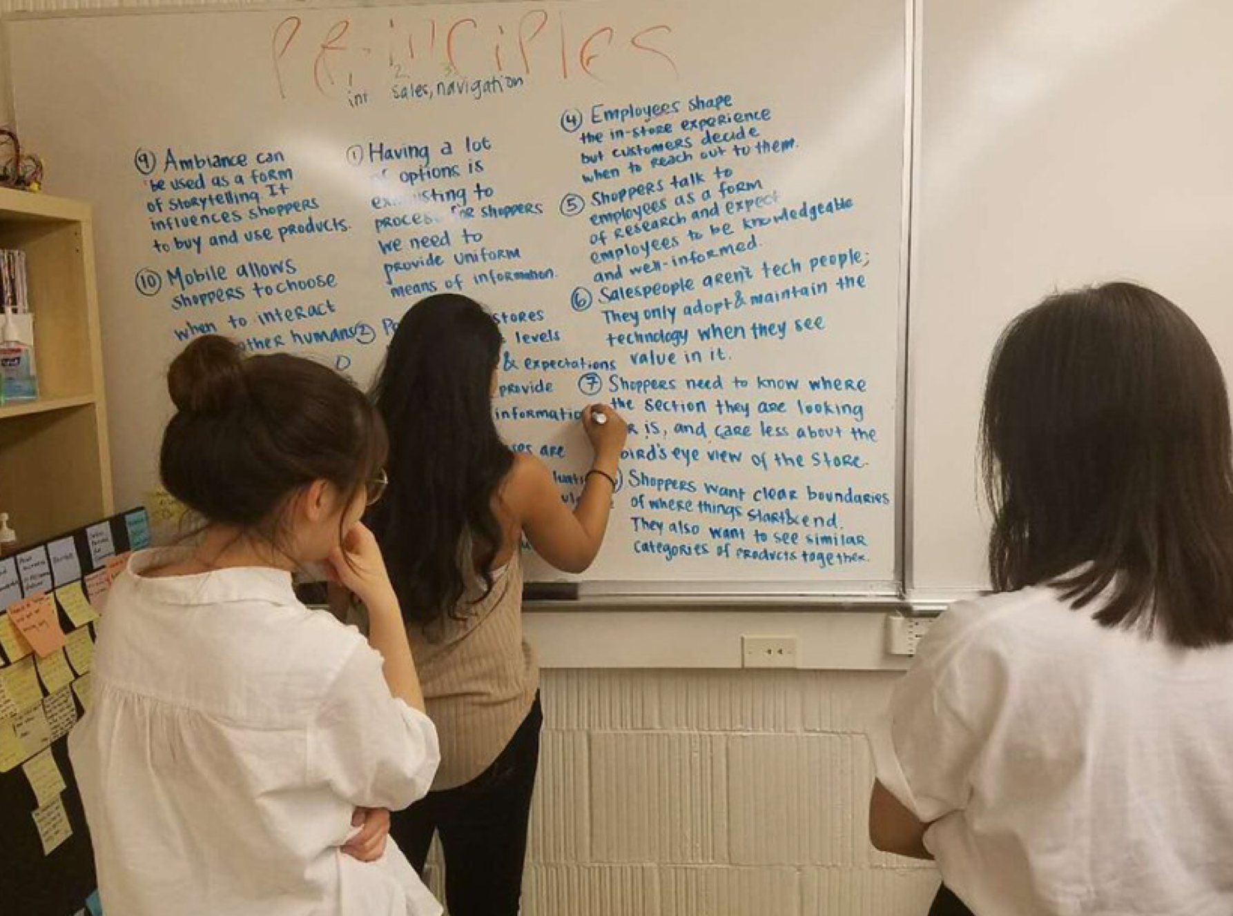
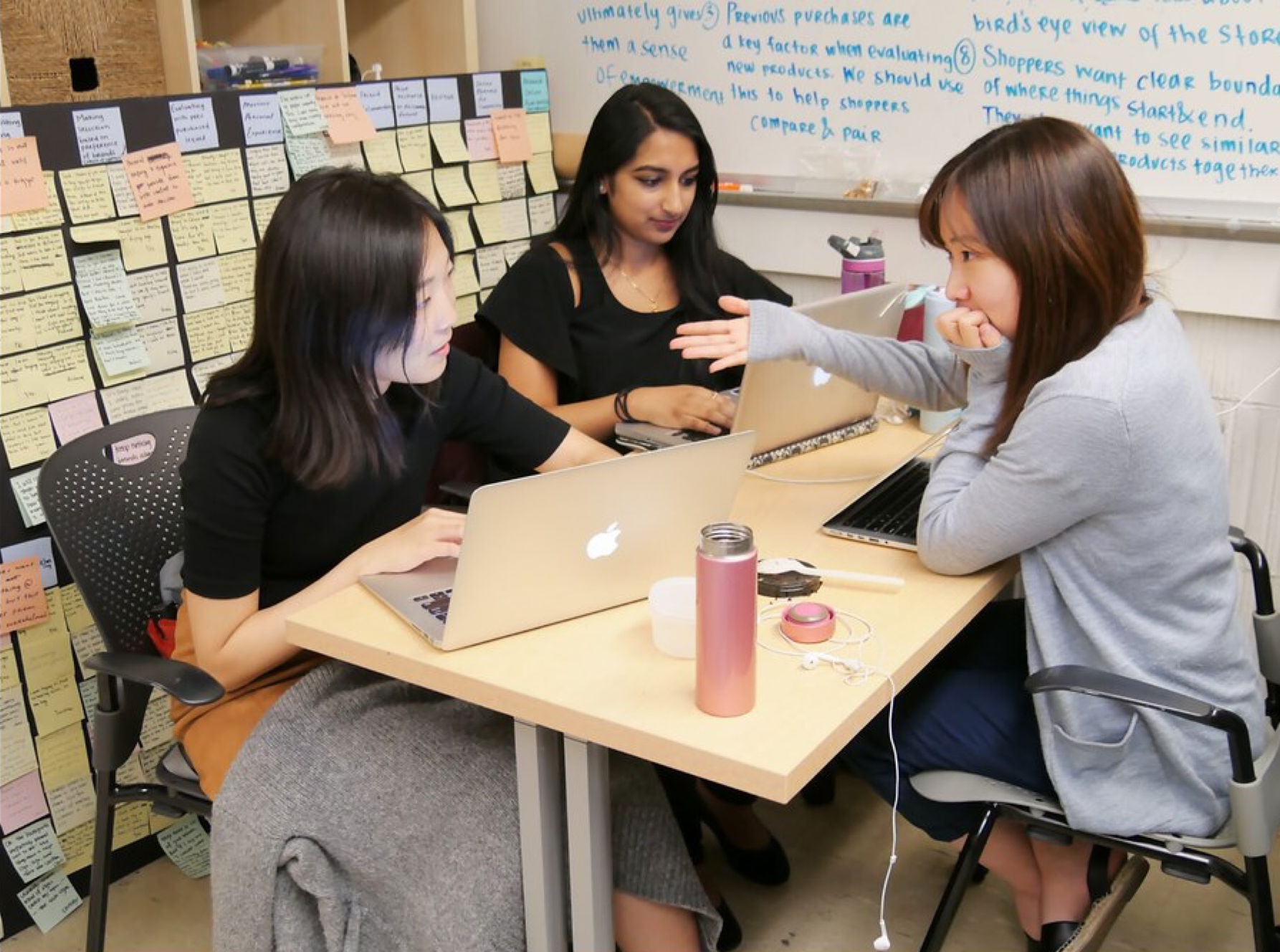
In six-month time period, our team start this project with retail as the broad topic area. We did both primary and secondary reserach to undertsand the store and customers. During the ideation and concept generation phase, we also collaborated with retail experts closely to deliver the content-rich design solution.
Sponsorship from:


My role
Concept ideation
Interaction design
Video prototype
Interaction design
Video prototype
Visual design lead
Poster design
Poster design
Collaborators
Siyi Kou & Shravya Neeruganti
Timeline
6-month immersive studio work









.svg)
